


The logo is the core element of the brand's visual identity. Its use must strictly follow established standards to ensure its integrity, legibility, and recognition.
Integrity
The Topring logo must not be modified, altered, or distorted under any circumstances. It must never be redrawn or recreated. Only official files (JPEG, PNG, or vector formats) provided by the marketing department are authorized. These are available upon request.
![]()
The horizontal version is the standard logo configuration and must be used on print and digital materials, unless otherwise specified in these guidelines.
Components
The logo typically includes one element: the signature.
A second version of the logo includes two elements: the signature and the tagline.
![]()
To ensure consistency in Topring's visual identity, elements must not be moved or separated, and the colour arrangement must not be altered. The logo may only be resized proportionally; stretching, compressing in one direction, or skewing is not permitted.
Use in Text
When the company name appears in the running text, it mus be written as Topring, with only the initial letter capitalized. It should be set in the same font and style as the surrounding text, without any special typographic treatment (such as all caps, distinctive colour, or the logo font). The official logo must not be used in place of the name within a paragraph.
Corporate Version
A version of the logo incorporating a red maple leaf and the company's year of establishment is used in specific contexts.
![]()
This version is reserved for packaging boxes and certain corporate pages of the website. It does not replace the primary logo and must not be used in regular communications without prior authorization. All applications must comply with the official proportions and colours defined in these guidelines.
Evolution
The Topring logo has evolved over the years, both in its composition and its graphic elements.
For several years, the signature was accompanied by a distinctive symbol: a grey bar, positioned above the name and matching its exact length. This graphic element was removed in 2015 as part of a simplification and modernization effort.
In addition, although optional, the inclusion of a tagline has always been part of the company's practices. It has also evolved over time, both in its content and in how it is integrated with the logo.
All previous versions of the logo are obsolete and must be replaced with the current official version.
Official Colours
The official logo colours must be used in accordance with the established specifications to ensure brand consistency and recognition.
Single Colour
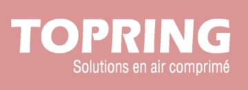
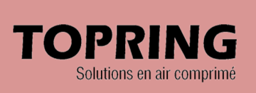
When the logo is used without the tagline (signature only), it must appear in a single colour. For both print and digital materials, the only approved colours are red and black. No other colours may be used.
![]()
|
Topring Red HEX CF0A2C RGB 207 10 44 CMYK 7 98 81 1 |
![]()
|
Black HEX 000000 RGB 0 0 0 CMYK 0 0 0 100 |
Two Colours
The two-colour version of the logo is preferred when the signature is accompanied by the tagline. In this case, the signature appears in red and the tagline in grey. This version should be used primarily on a white background or on a background that provides sufficient contrast to ensure optimal legibility.
![]()
|
Topring Red HEX CF0A2C RGB 207 10 44 CMYK 7 98 81 1 |
|
Topring Grey HEX A0A0A0 RGB 160 160 160 CMYK 0 0 0 75 |
Solid Black
The choice between solid black and 50% black depends on the background contrast. If the background does not provide sufficient legibility with 50% black, the solid black version must be used.
Reversed (White)
When the background does not provide sufficient contrast for the red, black, or two-colour versions, the reversed (white) version must be used.
In the case of monochrome printing that does not use red or black, or when printing in two or three colours other than the official colours, the reversed (white) version should be used whenever contrast allows. Otherwise, the logo must be printed in the darkest available colour to ensure maximum visibility.
Clearance Area
To preserve the integrity and visual impact of the logo, a minimum clearance area must be maintained around it at all times. This area corresponds to a rectangle whose width is equivalent to that of the letter ‘I’ in the word ‘Topring.’ No graphic elements — logos, text, images or any other visual content — must encroach upon this space.
![]()
Minimum Dimensions
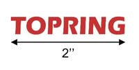
The size of the Topring logo must be proportional to the format of the medium while respecting a mandatory minimum width.
- For print, the minimum allowed size is 25.4 mm (1 inch) in width.
- For digital use, the minimum allowed size is 96 pixels in width.
Below these dimensions, the legibility and integrity of the logo can no longer be guaranteed.
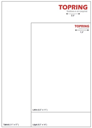
Print Formats
For standard paper formats used in Canada, the specifications outlined below must be followed. The logo may only be resized proportionally. Any distortion, modification, or alteration is prohibited.
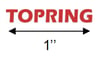
| Small |
For a bookmark, invitation card, postcard, or any other small-format printed material, the recommended minimum width is 1 inch.
|
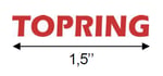
| Medium |
For a flyer, brochure, or any other printed material measuring 9 inches by 12 inches or smaller, the recommended minimum width is 1.5 inches.
|
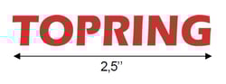
| Large |
For a poster and any other printed material larger than 9 inches by 12 inches, the recommended minimum width is 2.5 inches.
|
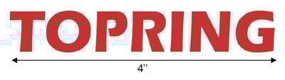
| Extra Large |
For a sheet and any other printed material larger than 17 inches by 22 inches, the recommended minimum width is 4 inches.
|
Special Applications
Certain applications, such as engraving and embroidery, involve specific technical constraints. Their use must follow appropriate dimensions and parameters to preserve the legibility and integrity of the logo.
| Engraving |
For engraving applications (laser or mechanical), the recommended minimum width is 20 mm (approximately 0.7 inches). When space is limited, the version without the tagline must be used. Lines and spacing must remain sufficiently wide to ensure clear reproduction.
|
| Embroidery |
For embroidery applications, the recommended minimum width is 50 mm (approximately 2 inches). The version without the tagline should be preferred to ensure legibility and quality of reproduction.
|
Digital Adaptation
Some digital applications require a simplified version of the logo to ensure optimal legibility at smaller sizes.
Official Icon
The official icon consists of the uppercase letter "T" from the logo. Two versions are permitted: a red "T" on a white background or a white "T" on a red background. This version is used for special media, profile icons, digital platforms, and PowerPoint presentations. It does not replace the full logo in formal corporate communications. No other variations are permitted.


Favicon
The favicon is the simplified "T" version used for display in browser tabs and bookmarks. Only the official version provided must be used. No modifications are permitted.
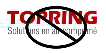
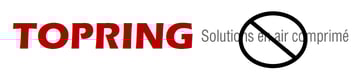
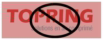
Incorrect Usage
Any use of the logo must strictly follow the established standards to preserve brand consistency and value. The integrity of the visual identity must be maintained at all times.
Proportions and Balance
The tagline must never be enlarged, reduced, or modified in a way that alters the original proportions of the logo. Any modification that creates a visual imbalance between the signature and the tagline is prohibited. The word Topring must remain the primary element of the signature.

Positioning
The tagline must not be moved or repositioned relative to the signature. The official logo configuration must be used without alteration.


Contrast and Legibility
The logo must never be used in a context where visual contrast is insufficient. When the signature is accompanied by the tagline, printing it in red, as a single colour is not permitted. In such cases, use the black version or the reversed (white) version, depending on the background colour and available contrast. Any application that does not follow these principles is considered non-compliant.


Logo Use on Images
When the logo is placed over an image, its legibility must be ensured at all times. The logo version used must follow the colour and contrast rules defined in the previous sections to guarantee optimal visibility.

When the image's natural contrast is insufficient, a white band may be placed behind the logo to improve legibility. A slight transparency may be applied to this band, not exceeding 80% opacity. Any other graphic solution must be approved by the marketing department.


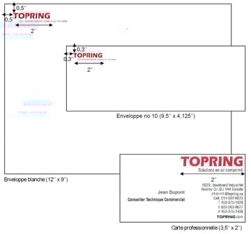
Corporate Stationery
The examples shown illustrate the application of the logo across Topring's corporate stationery. Any new corporate document or official form must be submitted for prior approval by the marketing department before production to ensure compliance with visual identity standards.
In form headers and envelopes, the logo must be used in a single colour, specifically Topring red. The logo must be accompanied by the official address, presented on a single line or according to one of the following configurations: below the logo envelopes and at the bottom of the page for letterhead.
Any other layout must be approved by the marketing department.

Promotional Items
Any promotional item featuring the Topring logo must be submitted for prior approval by the marketing department before production. The marketing department reserves the right to refuse any proposal that does not comply with the established graphic standards.


Download Topring Logos
Access official Topring logos in PNG and EPS for digital and print use.

Specific Uses − Embroidery
Embroidery applications require files adapted to the type of fabric, size, and technique used.
The standard files provided (PNG, EPS) are not intended for this purpose.
Please contact Topring to obtain the appropriate embroidery file.
The official colours define the brand's visual identity and must be used in accordance with established standards to ensure consistency and recognition.
Primary
Primary colours from the foundation of the visual identity and should be used in the majority of applications.
|
Background, Text, and Table Borders |
Pearl Grey HEX F3F3F3 RGB 243 243 243 CYMK 0 0 0 5 |
|
Text |
Charcoal HEX 464646 RGB 70 70 70 CYMK 0 0 0 73 |
Accent
Accent colours are used to highlight specific visual elements without dominating the overall composition.
|
Text and Logo |
Topring Red HEX CF0A2C RGB 207 10 44 CYMK 7 98 81 1 |
|
|
|
||
|
Black HEX 000000 RGB 0 0 0 CYMK 0 0 0 100 |
|
Text, Logo and Background |
White HEX FFFFFF RGB 255 255 255 CYMK 0 0 0 0 |
Secondary
Secondary colours complement the primary palette and are used to structure information and graphics.
|
Table Header |
Silver HEX A7A7A7 RGB 167 167 167 CYMK 0 0 0 35 |
|
Website Banners and Social Media |
Gray40 HEX 666666 RGB 102 102 102 CYMK 0 0 0 60 |
|
Accent |
Light Grey HEX CCCCCC RGB 204 204 204 CYMK 0 0 0 20 |
Product Borders
This colour is reserved for frames and dividing elements surrounding products to ensure consistency and readability.
|
Frame Around Product and Table |
Light Grey HEX CCCCCC RGB 204 204 204 CYMK 0 0 0 20 |
Typography is a key component of the visual identity. Consistent use ensures clear communication and reinforces brand recognition across all media.
Printed Documents
To ensure consistency across documents, it is essential to use the following font.
Primary Font
The preferred font for all printed brand communications is Helvetica Neue LT Pro.
Secondary Fonts
If the primary font is unavailable or due to technical constraints, the alternative fonts are Oswald or Arial.
Digital Media
To ensure consistency across digital platforms, it is essential to use the following font.
Primary Font
The preferred font for all digital brand communications is Roboto.
Secondary Font
If the primary font is unavailable or due to technical constraints, the alternative font is Arial.
Spacing and Legibility
Line spacing and margins must ensure comfortable reading across all screen sizes.
- Recommended line spacing: 1.4 to 1.6 for body text
- Sufficient spacing between headings and paragraphs
- Consistent and uniform margins across all interfaces
The typographic hierarchy must remain clear and well structured, without visual clutter.
Product marking ensures clear and durable brand identification on products. Its application must strictly follow established standards to preserve the integrity and consistency of the visual identity.
Authorized Methods
The following methods are authorized depending on the product type and material. Any other method must be approved in advance by the marketing department.
- Laser engraving
- Mechanical engraving
- Pad printing
- UV printing
- Screen printing
- Integrated moulding
- Embossing (raised or recessed)
- Adhesive labelling (industrial stickers)
Adhesive Labelling
The use of adhesive labels must ensure:
- Durable adhesion
- Resistance suited to the operating environment
- Precise and consistent placement
Any label that does not meet quality standards is prohibited.
Logo Version to Use
For the product marking, the version without the tagline should be preferred. The monochrome version is recommended. The logo must not be used in two colours if the technique or surface does not allow for accurate reproduction. Legibility must remain optimal at all times.
Minimum Dimensions
To ensure clear and durable reproduction:
- Engraving: minimum width of 20 mm
- Limited surface: avoid reducing below 15 mm
Below these dimensions, legibility and marking quality can no longer be guaranteed.
Positioning
The logo positioning must:
- Respect the official proportions
- Be aligned consistently with the product's geometry
- Avoid being placed too close to edges, joints, or functional elements
- Maintain sufficient contrast with the surface
Contrast and Legibility
The marking must provide sufficient visual contrast with the surface of the product. On dark surfaces, use light-coloured engraving or reverse marking. On light surfaces, use dark-coloured marking. Any application that compromises legibility is considered non-compliant.
Restrictions
The following are not permitted:
- Modifying, stretching, or compressing the logo
- Adding graphic effects
- Altering proportions
- Using an unauthorized version
- Repositioning the tagline
Approval
Any new marking or application must be approved by the marketing department prior to production.
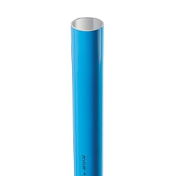
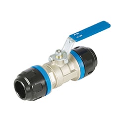
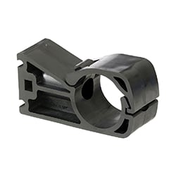
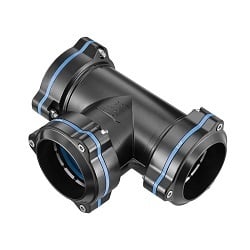
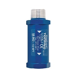
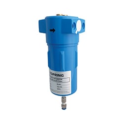
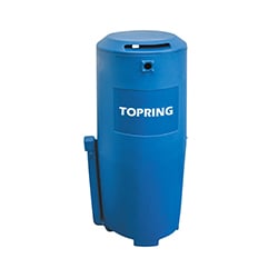
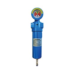
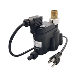
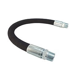
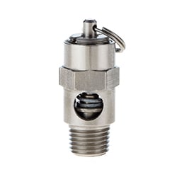
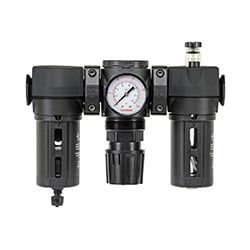
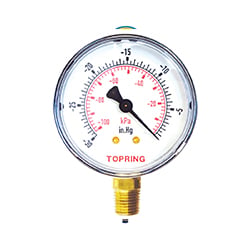
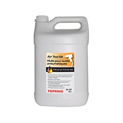
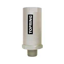
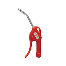
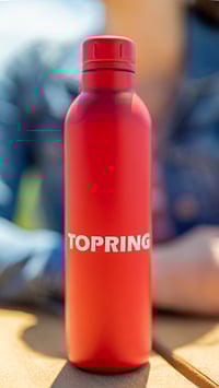
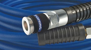
Product photography must reflect the quality, precision, and rigour associated with the brand. Its use must remain consistent across all media.
Priority of Use
Official product photographs provided by Topring must always be used as a priority. Any other image must be approved in advance.
Usage Guidelines
Product photographs must:
- Present the product clearly and accurately
- Highlight key features
- Maintain visual consistency across all media
- Rein force a consistent professional image
Visual Style
Images must:
- Present the product on a white or neutral background
- Provide a clean, uniform, and distraction-free appearance
- Maintain consistent framing from one product to another
- Ensure accurate rendering of colours and materials
Images that are overly contrasted, stylized, or inconsistent with this style should be avoided.
Contextual images may be used when they add value in understanding (application, installation, usage), provided they respect the brand's visual identity.
Image Integrity
Photographs must be used without alteration.
The following are not permitted:
- Modifying the product's shape or proportions
- Altering its colours or texture
- Adding unapproved visual effects
Minor adjustments (such as slight cropping or brightness adjustments) may be acceptable, provided they respect the integrity of the product.
To Avoid
- Images of insufficient quality or not meeting standards
- Non-neutral backgrounds without justification
- Visual styles inconsistent with official images
- Excessive cropping that cuts off important parts of the product
- Use of images from unauthorized sources
These practices undermine brand consistency and credibility and must be avoided at all times.
Visual Consistency
Images must be consistent across all media (catalogue, website, technical sheets, presentations), particularly in terms of:
- Background
- Framing
- Lighting
- Overall style
Image Quality
- Print: minimum of 300 DPI
- Digital: at least 72 to 96 DPI
- Recommended web width: between 1000 and 1200 pixels, depending on usage and platform
Blurry, pixelated, or compressed images are not permitted
Approval
Any new photoshoot or visual direction must be approved by the marketing department prior to release.
Third-Party Use
Product photographs provided by Topring may only be used by authorized distributors and partners, in accordance with established standards. Images must be used as provided, preserving their visual and technical integrity.
The following are not permitted:
- Modifying, cropping, or altering the image without prior authorization
- Adding unapproved graphic effects or visual elements
- Altering the product's colours, proportions, or features
- Using compressed, degraded, or low-resolution versions
Any adaptation or specific use must be submitted for prior approval by the marketing department.
Product photographs remain the exclusive property of Topring and may not be used for any purpose other than the promotion and sale of authorized products.
Interactive Content and Video
360° views and videos must follow the same visual standards as product photography:
- Accurate product representation
- Controlled background and environment
- Consistency with the visual identity
- No misleading or excessive effects
Any modifications or reuse must be approved.
When in doubt, always use official visuals or consult the marketing department.
Graphic applications illustrate the practical implementation of visual identity elements across all communication materials. Their use must follow established standards to ensure a consistent and unified brand presentation.
General Principles
The application of the visual identity must:
- Respect the logo proportions
- Maintain the defined typographic hierarchy
- Use only the official colours
- Ensure a clear and structured layout
- Preserve adequate white space
Any unbalanced or non-compliant composition is not permitted.
Corporate Documents
Administrative and corporate documents must follow the official templates.
This includes, in particular:
- Letterhead
- Envelopes
- Business cards
- Email signatures
- Official presentations
Any creation or modification of templates must be approved by the marketing department.
Technical Documents and Product Sheets
Technical sheets and product documents must:
- Maintain a consistent structure
- Follow the defined typographic hierarchy
- Use photographs that comply with established standards
- Integrate the logo according to defined rules
Consistency across all documents is essential.
Marketing Materials
Promotional and advertising materials must:
- Respect approved logo proportions and versions
- Maintain adequate visual contrasts
- Avoid visual clutter
- Ensure consistency with other materials
Any stylistic variation must be approved in advance.
Co-branding and Partnerships
When a partner or distributor logo is displayed alongside the Topring logo, the following rules must be respected:
- The Topring logo must not be disproportionately reduced
- Proportions and clear space must be maintained
- No graphic element may compromise the integrity of the logo
In a multi-brand context, the Topring logo must maintain equal visibility and consistent treatment.
Any co-branding configuration must be approved by the marketing department.
Digital Media
Digital applications (website, newsletters, social media, digital presentations) must:
- Respect the official colours
- Use approved digital versions of the logo
- Maintain a consistent typographic hierarchy
- Ensure readability and accessibility
Responsive adaptations must preserve the integrity of the visual identity.
Accessibility and Contrast
Digital applications must ensure sufficient contrast between text, graphic elements, and backgrounds.
A minimum contrast ratio compliant with accessibility standards (WCAG 2.1 Level AA) must be maintained for all text content.
The following are not permitted:
- Using red text on a low-contrast grey background
- Using white text on a red background if legibility is compromised
- Applying colour combinations that hinder readability
Readability must always take precedence over aesthetic considerations.
Approval
Any new graphic application, template, or significant adaptation must be approved by the marketing department prior to release.
Any use of the visual identity not explicitly covered in this guide must be submitted for prior approval by the marketing department.
The marketing department is responsible for the application and interpretation of these standards.
Brand Owner
The marketing department is responsible for managing, distributing, and updating Topring's visual identity standards.